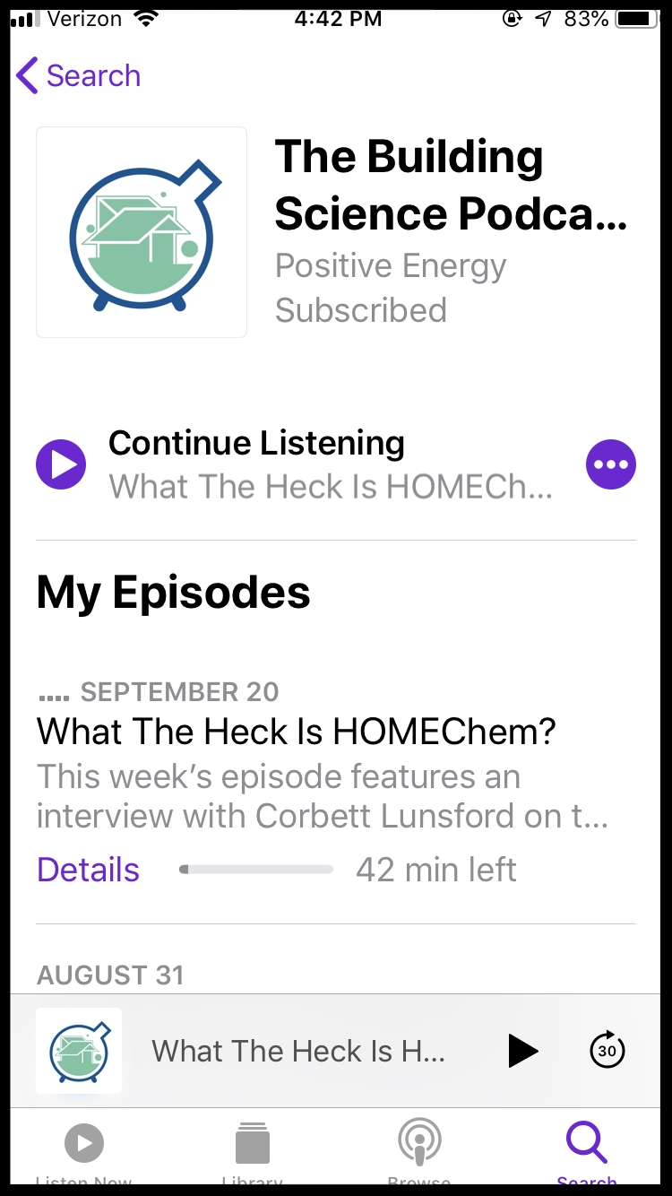
The Building Science Podcast Logo Gets An Update
Over the course of the last 4 months or so the task of slowly redesigning The Building Science Podcast’s logo has drifted on and off my desk. It’s needed to happen for a while (as you’ll see and I’ll explain). So I finally had enough time between fire drills the last couple of weeks to let my mind drift long enough to arrive at that liminal space between inspiration and pragmatism. So here I am to tell you all about this wonderful new logo and aren’t you so proud of me and yes I love you too. :)
The original logo was clunky, phallic, and busy, but it managed to get across the following ideas:
This is a podcast’s logo
This podcast is mostly about engineering and science as it pertains to buildings
The maker of this logo didn’t know exactly what they were doing or what this logo was supposed to communicate (pssst… it was me, I’m the one who didn’t know any of that)
The big problem with those points is that the important ones (1. and 2.) are only really communicated with the text in the logo, which is a pretty low bar. The point that I would have rather avoided all together (3.) is well expressed in the actual imagery, which when I began to analyze, made very little sense to what the show is about. To be frank, when I asked myself what that imagery actually communicated, I was at a loss. But like all work, when we realize something can be improved, we should endeavor to improve it. In this case, I wanted to find a way to make a simpler, expressive logo that visually communicated what The Building Science Podcast is about.
The show is about human society as it is expressed in buildings, evaluated with the lens of scientific inquiry and critical thinking.
Through time the show has become more nuanced in its approach, refined in its production quality, and sharply focused on a much larger mission than the less serious tone we had in our early days, back when we were just nerding out about building physics with a microphone. We still have some of that, but we’ve pivoted to embrace a much larger and more important topic - that our homes have a profound impact on human health at both the microbiomic level and the macro-ecological level. It’s actually insane how little attention homes get in the big picture of human life on the planet, but so much of the human experience intersects in our species housing of itself.
I thought this shift in tone warranted a new look to express how the show has changed, especially as we approach our 5th yearly season in 2019. With new seasons come change. And we really do look at our show as but one way of accomplishing the mission of pointing architecture and construction practices toward a more human centered era. The whole show is based on change and potentiality. The more attractive and “normal” we can communicate that idea, the better.
So I played with a few ideas here and there during the process that didn’t really stick, as one does when finding imagery worth keeping and using. After several months of haphazard effort, I finally landed on a simple concept that played off the original logo, made a clear statement about the show, and served as a more elegant visual representation of the problem the show is meant to address.
The message is simple - our homes are complex experiments and we’re living inside them all the while. That’s literally what we talk about in some nuanced form or another each and every episode of the show.
I want to think that I almost got there with the original logo, but the message got lost in the clutter; the unnecessary gear wheel protruding from the edge of the round-bottom-flask with a spout far too long, and the clumsy representation of earth inside it. It’s trying too hard and still relying on the text to communicate anything meaningful. The message needed to stand on its own more simply. It needed to rely less on connecting complicated intellectual dots. It needed to look less like an engineering podcast right out of the gate. You don’t just tell someone you’re an engineer on the first date!
Logistically, it was a straight forward design. There were only a few elements. I endeavored to play with contrast between the circular flask-shape and bubbles against the angular corners of the building inside. I stuck with our company colors because I think they’re beautiful together and it otherwise wouldn’t have been as easily identifiable in our audience’s transition in familiarity. You have to ease into a new look, just like a haircut. I also really enjoyed that I didn’t have to deal with any typography because it simplified so much of the decision pathway. I did a fair bit of research on the podcasting app to see what stands out well, as well as informal focus grouping with architects and graphic designers I know and trust enough to be honest with me when they see something bad. None complained.
And voila!
I really think the new logo finds a more understated, less busy way to communicate the idea of a home as an experiment that needs to be understood. And it doesn’t hurt that it looks great in Apple Podcasts.


